
So I found this Poster for an Ad campaign about dumping rubbish into the Ocean, as the main theme of the poster is about Oceans i really liked this idea that the designer had used for this poster. I like the simple colours that are used and how it is really effective. I think the poster is eye catching as it uses colour as the main concept so it would stand out from wherever it would be posted. I also like the contrast of the white objects against the background so it makes the rubbish stand out and makes all the illustrations the designer has used in the poster easy to see, even though there is little detail on the illustrations it is still clear what they are.
I like the font the designer has used here as it is very simple Sans Serif but it is very bold again making it stand out. I think for an Ocean theme choosing a font can be quite difficult. So a Font i would choose would be one that is readable and clear to the viewer.
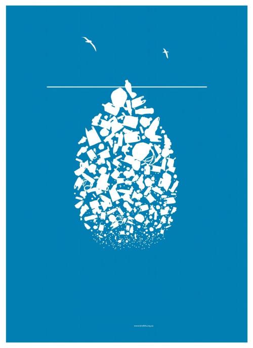
Here is another Poster i found which is possibly for the same campaign as the last poster. Again i really like this style of design as it is very simple and minimal and it goes with the term Less is more, which i try to apply to my designs without making it too simple to the point it is basic and looks like minimal effort.
When trying to find examples of interactive iBooks on the internet, i couldnt find any noteworthy examples, and if there were any they would be on the App Store for a price. I found this uninspiring as there isnt a market yet for iBooks that are truly interactive for people to learn from. Hopefully within the future there will be a great market as i truly see potential for it to happen.
No comments:
Post a Comment