So here we are, back again in the second year of the Foundation Degree after a long summer holiday. It feels good to return back to the course, to start working again and getting back into the swing of things.
So the first assignment we have been set is Animation. Any assignment we get set based on video i thoroughly enjoy so i am looking forward to start on this one. The new Brief states that we need to produce a short 25 second animation that follows a story of a red balloon and has to contain a few principles such as: Making the balloon increase/decrease in scale or speed, collision etc. I think this is a good idea for an assignment since we can be as creative and imaginative as possible. Already i have come up with a few ideas but still deciding on what style of animation to create it in. Since we can use After Effects it gives us a lot of freedom and to be creative. I have not had any experience with After Effects, however we were shown Video CoPilot. Video CoPilot is a tutorial website for After Effects for beginners such as myself. It also shows how to create effects such as lightsabers, working with green screen, 3D elements and much more. This area of media is what i am interested in working with since you can see your work come to life and can tell a great story. I am looking forward to starting this project.
Wednesday, 24 September 2014
Wednesday, 11 June 2014
Validity and Accessibility of my Website
Validation
As the website comes to a finish I needed to ensure that the website was validated by w3 so it would work correctly if I did publish it.

When i first went to validate my Index.html page it had 55 errors and 2 warnings, i was told that the warnings were nothing to worry about but i had to fix the errors in my code. Fortunately the errors in my code were nothing major that could potentially break my website. A lot of the errors were minor issues such as "Include Alt text for your img" which i needed to do for all of them, as well as closing tags that i had left open which all of them were </a> tags so again these were nothing major.
Accessibility
For our Websites as well as testing if they were Validated, we also had to check if they were accessible to other users that need certain requirements to view websites.
On w3 they had a general list that websites need to be able to pass the accessibility test.

As the website comes to a finish I needed to ensure that the website was validated by w3 so it would work correctly if I did publish it.
When i first went to validate my Index.html page it had 55 errors and 2 warnings, i was told that the warnings were nothing to worry about but i had to fix the errors in my code. Fortunately the errors in my code were nothing major that could potentially break my website. A lot of the errors were minor issues such as "Include Alt text for your img" which i needed to do for all of them, as well as closing tags that i had left open which all of them were </a> tags so again these were nothing major.
Accessibility
For our Websites as well as testing if they were Validated, we also had to check if they were accessible to other users that need certain requirements to view websites.
On w3 they had a general list that websites need to be able to pass the accessibility test.
Looking at my website i know that it has passed the accessibility test. It does have a page title, alt text for images, headings etc. The colours are strong and opposite to each other so anyone that requires visual aid should not have a problem viewing my website and hopefully anyone with any disability that requires certain needs to be able to view my website.
Creating a slideshow
For my website i added an image gallery of the list of animals i talk about. Adding an image gallery was quite complicated especially trying to find a helpful tutorial that was responsive, simple and didn't require me to enter my debit card details to watch the full video!
Luckily i found a website called GitHub which is an open source website where people will share their codes for other viewers to use and help improve on. For me this was very handy as I did not know how jQuery works so i needed to find other resources that showed me how to do it. The slideshow i found was a full screen responsive slideshow with buttons to let the user change image manually rather than a automatic transition between slides. On my previous website layout i did use a slideshow for my home page, however it was a free download and the images had a watermark over the top of them when i create the slider, i didn't think this looked professional so i decided to look for a different slideshow code where there wasn't a watermark.

As you can see my slider is a full screen and is very simply styled with just two buttons and the images. I think this is the best style as it has everything essential you need for a slideshow, no fancy over the top animations between images or borders.
Again for the Mobile device version, the slideshow is 100% width across the screen so it fits the viewer window. The image quality does not decrease and i think that the slideshow is still accessible from a mobile view as the buttons are still a size where you would be able to tap on the arrows to view the slideshow.
Why is my website all on one page?
In this post i thought i would talk about my decision of making my website on a single HTML page instead of spread across different pages.
When researching different websites for inspiration a lot of them were shown on a single page and their content wasn't spread across many different pages. At first i thought it was a unique take on website design. I know for sure that I wouldn't want to create a website that takes a long time to scroll from the top to the bottom but it still needed a decent amount of content. However with making it all on one single page i think it saves a lot of confusion for trying to find specific content that could potentially be on another page that's difficult to locate.
So for the navigation instead of linking to another page I use anchor points. Anchor points are when you can link to other parts on the same page. For example when a website uses a 'back to top' button they use an anchor to link to the top of the page when the user clicks on the button. Essentially my website does the same for the entire website navigation.
When researching different websites for inspiration a lot of them were shown on a single page and their content wasn't spread across many different pages. At first i thought it was a unique take on website design. I know for sure that I wouldn't want to create a website that takes a long time to scroll from the top to the bottom but it still needed a decent amount of content. However with making it all on one single page i think it saves a lot of confusion for trying to find specific content that could potentially be on another page that's difficult to locate.
 |
| A .GIF showing the navigation of my website. |
So for the navigation instead of linking to another page I use anchor points. Anchor points are when you can link to other parts on the same page. For example when a website uses a 'back to top' button they use an anchor to link to the top of the page when the user clicks on the button. Essentially my website does the same for the entire website navigation.
Re-Design of Website
So when i started my website as i slowly started to build it i wasn't sure in what direction it was going. I was building upon new ideas that was just coming to mind at the time. There was no plan or structure to it and eventually i wasn't happy with the way it looked. It looked too cluttered and unprofessional, the colour schemes were off and it didn't look visually pleasing at all. So i decided to go back to my sketch book and draw up some new ideas with a new set of ideas. I soon realised that a lot of websites have one thing in common: simplicity. When looking at some websites that had won awards for their responsiveness, it was all about the styling and how simple it was. Some of them just simply used images with very little text on them. I think these websites worked the best as you didn't have to take in a lot of information all at once it was structured very well and had clearly been thought out how to make it interesting without having too much for the user to look at.
This is a screenshot of the home page of my new website. The design i went for was a full screen effect where images would take up the whole screen. This is a common trait amongst responsive design website and i personally think it looks professional and less boring. My home page has a .gif image I found of a cinemagraph of a humpback whale where the reflection of the ocean moves on its back. I think that it is simple concept but it works out really well as it adds some more visual styling to the homepage rather than just a plain image.


 |
| My new website home page |
This is a screenshot of the home page of my new website. The design i went for was a full screen effect where images would take up the whole screen. This is a common trait amongst responsive design website and i personally think it looks professional and less boring. My home page has a .gif image I found of a cinemagraph of a humpback whale where the reflection of the ocean moves on its back. I think that it is simple concept but it works out really well as it adds some more visual styling to the homepage rather than just a plain image.
So for each section i added a banner of an image and the title. I thought it would be good to add a button that takes you back a section as it saves a lot of scrolling especially when viewing my site on a mobile device. I also added a parallax scrolling effect when you scroll past each banner, it adds a 3D effect which i think adds to the look and feel of it.
Here is my coding to achieve the background parallax effect. It was as simple as making the background fixed. From there the background would remain in a fixed position and the text positioned around it would move, this would make it look 3D.
Another part of my website i changed was the Navigation. My old navigation was still responsive however the icons and the styling of it looked too simple and boring, as i had downloaded it instead of making it myself. For this new navigation bar i followed a simple Youtube tutorial on how to make it responsive and how to create a button for when it goes down to a mobile size.
This is what my navigation looks like on the desktop screen. I used a simple sans serif font and changed the opacity of the background to 0.5. My original idea was to make the nav bar fixed and move with the screen but I later found out that a lot of websites don't really use a fixed nav bar.
These are some screenshots of my website when it's at a mobile size. As you can see the navigation shrinks down and hides the menu options and only the 3 line icon appears. This icon is used on most websites for mobile devices so i thought it would be good to use it for mine as it is recognised easily. When you click on the button the navigation becomes a drop down menu. When the menu drops down the H1 title of 'Oceans' also moves down with it. At first it did this on it's own but now i think it is better that it does it like that rather than the nav bar going over the top of it and having the two elements clashing with each other. Again i made the nav bar for mobile have a lower opacity as it goes well with the background image and makes it more visible so you don't lose half the image because of the nav bar.
Sunday, 25 May 2014
Inspiration from Existing Websites
In this post i thought i would show and talk about some websites i explored and looked at to gain some inspiration for my website. The websites i explored had great user interactivity and what i thought were simple yet effective.

Glastonbury Festival
The third website I looked into was Glastonbury Festival. As of last week they re-designed and launched a brand new website for this years event.
 This image is what the old website used to look like. The main purpose was to show to the user the spirit of the festival while maintaining a good user interface. Personally i do prefer the old website background and the general look and feel that it had in comparison to the new one. However the old website was not responsive and the interface was getting outdated as it had been like this for a few years.

The first website i found was Cascade Brewery Co. The Website itself isn't responsive to Tablet or Mobile devices, however i still think the Desktop design could easily be adapted to those devices.
Cascade Brewery Co.
The layout of this Website is fairly basic but very effective. I really like the use of 'tiles' as buttons that also act as navigation for the user. I think this makes the Website very user friendly, so people will want to stay on the website rather than have it cause confusion by a complex design where most people will most likely leave the page. I like the colour scheme used on this website as it makes me think of a classic irish bar and the logos used on the tiles very much associate with that. I also like the art style used on this website within each tile, they remind of a 1940s war propaganda poster which makes me think that the company has been making brews for a long time so it is a trusted company.
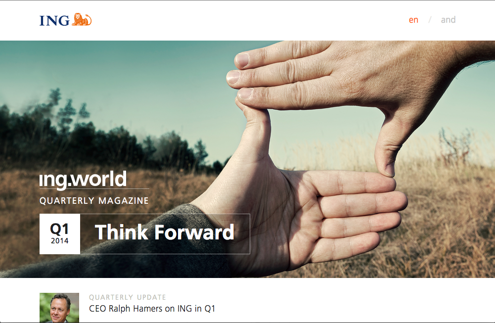
ING World Magazine
The next website i looked at was ING World Magazine, the website is very responsive to other devices and i like the way it responds to each device.
I like the layout of the website as it is a single column website that uses the full width of the device you are viewing the website on. While the content of the website is mainly images that link to other parts of the website, the home page is very simple and user friendly, you can see that the main focus is the styling on this website; as it is a magazine it is understandable that this is the main concept. A lot of hover zoom and z-index is used to create a 3-D effect for the user when they are scrolling down the page. I personally like this style on websites and would like to use it on my own websites however it takes a lot of time and is a very advanced piece of coding to be able to get it right!
ING World Magazine
The next website i looked at was ING World Magazine, the website is very responsive to other devices and i like the way it responds to each device.
 |
| Desktop Version |
 |
| Tablet Version |
 |
| Mobile Version |
I like the layout of the website as it is a single column website that uses the full width of the device you are viewing the website on. While the content of the website is mainly images that link to other parts of the website, the home page is very simple and user friendly, you can see that the main focus is the styling on this website; as it is a magazine it is understandable that this is the main concept. A lot of hover zoom and z-index is used to create a 3-D effect for the user when they are scrolling down the page. I personally like this style on websites and would like to use it on my own websites however it takes a lot of time and is a very advanced piece of coding to be able to get it right!
The way the website responds to other devices is very simple and manages to maintain the same style throughout each devices, so you know you are on the same website where as other websites look very different on the mobile version in comparison to the desktop version.
Glastonbury Festival
Glastonbury Festival is a music festival that happens every year in Somerset and is certainly the most popular music festival in the U.K. Recently the website got a new design that is fully responsive to other devices.
 |
| Desktop Version |
 |
| Tablet Version |
 |
| Mobile Version |
The third website I looked into was Glastonbury Festival. As of last week they re-designed and launched a brand new website for this years event.

The new website does bring a different look and feel that i do think is new and brings a new vibe to it. It definitely has a Art style to it which Glastonbury is a festival of "Contemporary Performing Arts". The font style is a Bold "LeagueGothicRegular" and the texture looks like it has been spray painted on to a wall to give that "youthful" look about it. The colour scheme are very bright colours, which of most are primary colours. There are no colours that contrast together, the colours do match with the banner that appears at the top of each page, but i think they also wanted to use colours that were the most bright and eye catching to the user and not go into too much detail with the reasoning behind it.
The website is split into two columns. On the home page there is a slideshow showing off all the acts that are performing that goes across the width of the page, but underneath that are small boxes that are headings of the big news that is happening at the event.
I think this a good use as it makes the website not too text heavy, especially as its only the home page so you wouldn't want it full of text as this can seem unappealing to the user.
On the right column is a list of useful information such as ticket information, how many days until the event and live tweets from their official Twitter account. This column is the same on each main page as it is vital information that people will most likely want to be able to access from anywhere and not want to have to go back and forth between pages to find out some important info.
In my website I would like the responsiveness of the ING World magazine when it scales down from Desktop to Mobile, and the simplicity of the Glastonbury Website in terms of content. I do like the art style Glastonbury has but i don't think it would work for a website about Oceans. I might try and experiment to see if any art style would potentially work while keeping the audience relevant and not completely changing the original look and feel.
Wednesday, 21 May 2014
Website Progress and Responsive Website Coding
Before going to OFFF i had some progress on my website. I thought i would use this blog post to talk about the progress of my website and the coding behind it all.

This is a current screenshot of my website in the desktop view. So far i am currently happy with the way it is going. My main focus is to add all the content in first and then design it all later as that takes a lot more time and effort and i would rather have all the information i needed in first.
With having experience from my A Level courses in Web Design, I found it easy to get back into coding again. There were a few changes to now having to work in HTML5 and CSS3 but luckily they were not major changes and actually made some tasks easier for me to handle.
To start off we were shown a basic skeleton frame that changes the layout of a column and makes it responsive for desktop, tablet and mobile. We would be using that frame for our own website to make the responsive side of it a lot easier to handle.
This is a screenshot from the Skeleton CSS page. As you can see the container is 960 pixels wide and it is split into 16 columns. Depending on which column you choose will determine the size of the column
This is what it looks like in Chrome or any web browser. As you can see it is the same group of text just copied and pasted into different columns, you can also see how the columns shape the text to fit perfectly within the container for the desktop size. I also added in some lines to go across the page to add some style and to show the separation of the columns more clearly.
So for my Website i have included in the Head Tag so that the skeleton framework will be applied to it. It also includes the Specific Media sizes so it will work for on Tablets and for Mobile.
Here is some Media Queries for my website that applies to different width sizes of the browser, depending on what device you are viewing it on. For example I have a slideshow in my website that you can view on the desktop and tablet, however i decided to remove it for mobile devices since the images would be too small and it wouldn't look as effective as it does on the other devices. To be able to achieve this i use this code in the Mobile Portrait size to Mobile Landscape and Mobile Landscape to Tablet Portrait media query. .slideshow { display: none; } This would then remove the slideshow when i shrink it down to mobile size.


This is a current screenshot of my website in the desktop view. So far i am currently happy with the way it is going. My main focus is to add all the content in first and then design it all later as that takes a lot more time and effort and i would rather have all the information i needed in first.
With having experience from my A Level courses in Web Design, I found it easy to get back into coding again. There were a few changes to now having to work in HTML5 and CSS3 but luckily they were not major changes and actually made some tasks easier for me to handle.
To start off we were shown a basic skeleton frame that changes the layout of a column and makes it responsive for desktop, tablet and mobile. We would be using that frame for our own website to make the responsive side of it a lot easier to handle.
 |
| Skeleton CSS |
This is a screenshot from the Skeleton CSS page. As you can see the container is 960 pixels wide and it is split into 16 columns. Depending on which column you choose will determine the size of the column
 |
| Skeleton FrameWork HTML Example |
 |
| My HTML for My Website |
So for my Website i have included in the Head Tag so that the skeleton framework will be applied to it. It also includes the Specific Media sizes so it will work for on Tablets and for Mobile.
 |
| Media Queries |
Here is some Media Queries for my website that applies to different width sizes of the browser, depending on what device you are viewing it on. For example I have a slideshow in my website that you can view on the desktop and tablet, however i decided to remove it for mobile devices since the images would be too small and it wouldn't look as effective as it does on the other devices. To be able to achieve this i use this code in the Mobile Portrait size to Mobile Landscape and Mobile Landscape to Tablet Portrait media query. .slideshow { display: none; } This would then remove the slideshow when i shrink it down to mobile size.
The screenshots above show the difference between the 3 devices on which my website is displayed, you can see the difference in font size, the slideshow not appearing on the mobile site and the navigation is styled differently.
I am happy with the progress i have made with my website and out of all my websites i have created this one is the one i'm most proud of, so far i've encountered no major problems with my coding (yet!) so with this progress i hope to be finished soon and will post some more blog posts about other elements of my website.
Subscribe to:
Posts (Atom)