So yesterday we all pitched our ideas to our peers.
Overall i was disappointed with the way my presentation turned out. Due to circumstances with problems with the server, software and other issues, my presentation didn't turn out as well as i had hoped. I had embedded videos into my presentation that didn't work, and i was rushed for time due to the time my presentation was pitched so it didn't feel 100% finished. I had a theme in my presentation which didn't load properly over iCloud so it looked plain and basic. Due to the videos not working properly i couldn't elaborate on specific points i was going to talk about which was related to my initial idea and style of editing.
I didn't receive any feedback on my presentation or my initial idea, so i will make changes to the presentation as i see fit and will have to ask people individually on what they think about my idea.
Wednesday, 29 January 2014
Pre Production
For my assignment so far i have thought of my initial idea and drawn out a storyboard for my different edits and types of shots.
My idea is going to be someone getting up to go to work. This will portray the journey of them waking up early in the morning, having a shower, making breakfast, putting on work clothes and finally getting in the car ready to drive to work. I think it is quite a lengthy journey and i could easily hit the 30 edits target which is part of the assignment criteria. Even if i shoot too much footage i can always take out unnecessary edits and sequences that aren't necessarily important so i can't fit the whole film into 20 seconds.
I have drawn up my storyboards and have one image per edit. I have included the type of shot it will be (close up, mid shot, extreme close up) and a brief description of what is happening in each edit.
I will begin principle photography this weekend and by next Tuesday will begin editing and sourcing sound tracks.
Wednesday, 22 January 2014
Research on Fast/Quick cut editing style
An essential part of this project is to use the effect of quick transitions that keep the user on edge and still visually interested. Often clips won't be any longer than a second long or it can lose the fast pace that it needs to maintain.
On YouTube i found a view examples of this type of editing style, however the full clip itself is less than 10 seconds long.
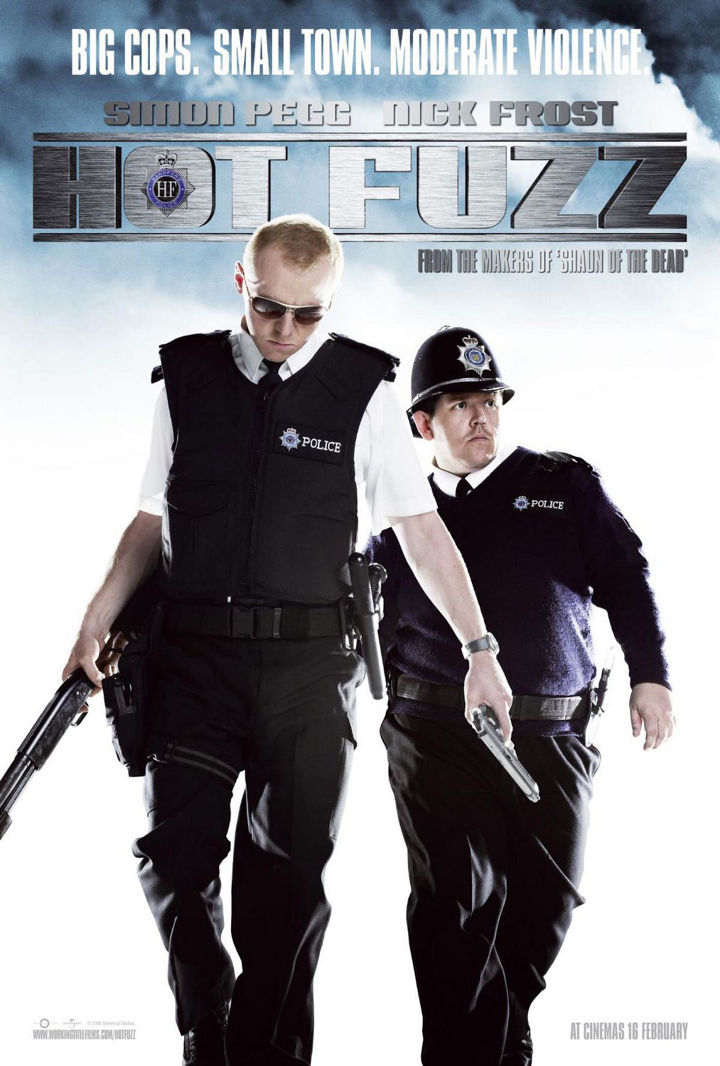
My set of examples i looked into was movies by Edgar Wright such as "Shaun of the dead" and "Hot fuzz", the style he uses is very typical of him as it is used across many of his films.


In Hot Fuzz the editing style he uses is a transition to get from one scene to another, the clip is about 5 seconds and uses 5 different cuts. He uses a lot of close up shots to emphasise the action that is happening, such as opening doors and clocking out from work etc. There is also a use of depth of field to get the action to be the main focal point, this is use of camera work and cannot be made in post production.
In Shaun of the dead, the transition scene is Shaun getting ready for work. It shows short clips of him cleaning his teeth, using the toilet etc. This sequence is also about 5 seconds and uses close up shots. Shortly after is another sequence of him making breakfast. This is made up of short clips of making spreading jam on toast and making a cup of tea, these are very stereotypically british things which add to the comedy of the film.
The last quick edit scene i found was The Plan about Shaun trying to think of a safe place to go and rescuing his family and friends. The scene consists of 3 different sequences of short clips of his different ideas. Again as a classic Edgar Wright style, they use many close up shots, but also use a range of wide angle shots that also pan across the screen. The transitions between clips are also a range of quick cuts and wipes from one side of the screen across to the other. The sound effects used are also exaggerated, as it is a comedy film i think that they can afford to use the sounds and keep the viewer interested, with noises such as drinking their tea and wheel spinning to show the fast movement of the car.
For my own project i will Edgar Wrights style of editing in these sequences as inspiration for my own sequence.
On YouTube i found a view examples of this type of editing style, however the full clip itself is less than 10 seconds long.
My set of examples i looked into was movies by Edgar Wright such as "Shaun of the dead" and "Hot fuzz", the style he uses is very typical of him as it is used across many of his films.

"Hot Fuzz scene transition"
http://www.youtube.com/watch?v=Y98tKxyQ1Xw
"Shaun of the dead quick cuts"
http://www.youtube.com/watch?v=4YY6mymW4oA
"Shaun of the dead - The plan"
http://www.youtube.com/watch?v=MeJzHSxRq40
In Hot Fuzz the editing style he uses is a transition to get from one scene to another, the clip is about 5 seconds and uses 5 different cuts. He uses a lot of close up shots to emphasise the action that is happening, such as opening doors and clocking out from work etc. There is also a use of depth of field to get the action to be the main focal point, this is use of camera work and cannot be made in post production.
In Shaun of the dead, the transition scene is Shaun getting ready for work. It shows short clips of him cleaning his teeth, using the toilet etc. This sequence is also about 5 seconds and uses close up shots. Shortly after is another sequence of him making breakfast. This is made up of short clips of making spreading jam on toast and making a cup of tea, these are very stereotypically british things which add to the comedy of the film.
The last quick edit scene i found was The Plan about Shaun trying to think of a safe place to go and rescuing his family and friends. The scene consists of 3 different sequences of short clips of his different ideas. Again as a classic Edgar Wright style, they use many close up shots, but also use a range of wide angle shots that also pan across the screen. The transitions between clips are also a range of quick cuts and wipes from one side of the screen across to the other. The sound effects used are also exaggerated, as it is a comedy film i think that they can afford to use the sounds and keep the viewer interested, with noises such as drinking their tea and wheel spinning to show the fast movement of the car.
For my own project i will Edgar Wrights style of editing in these sequences as inspiration for my own sequence.
Tuesday, 21 January 2014
AF105 Time Based Media
So last week we got set a new brief for the new assignment. The new assignment asks us to create a short film that portrays a journey. Personally i am excited for this assignment as this area of media i feel i can be most creative and have lots of ideas to go with it. Also this is the area of media i want to pursue after the course.
As it is still early stages i'm still not 100% sure what my final idea will be, however i can still create my storyboards and elaborate on those ideas and feel what will be my strongest idea. However it won't be anything too over complicated that will take a lot of time to film and put together in post production.
As it is still early stages i'm still not 100% sure what my final idea will be, however i can still create my storyboards and elaborate on those ideas and feel what will be my strongest idea. However it won't be anything too over complicated that will take a lot of time to film and put together in post production.
Tuesday, 7 January 2014
Mock Ups
Since it's been a while since i've updated this blog, i thought i would share my mock up ideas for the book "The Outsiders".
As you can see my ideas for my mock ups are based upon my research on the designers: Eric Tan and Malika Favre. I went for a minimal style as personally i enjoy this kind of artwork and enjoyed creating my mock ups in this style. For my mock ups i stuck with a consistent theme throughout, of having a greaser hair style and the same fonts. I decided to experiment with different colour schemes to see which one would stand out the most and which colours would contrast better with each other.
 This is my first mock up. I decided to go for the white background, even though it seems quite plain i think the other elements make up for it such as the red title, this gives the illusion of blood dripping. Also the black hair stands out much more bold here and is quite eye catching.
 For my second mock up I decided to change the background colour to black and the hair style to white. This gives a much darker tone to the book and overall a more serious look. Personally this is my least favourite out of the three due to the colour of the hair. However if i changed the colour of the hair to red it still wouldn't look very effective. Although i think the red text looks the strongest in this mock up.
 For my third mock up i changed the colour of the text to black and the background colour to red. As much as i liked the red text it still looks effective in black and the background colour of red is really strong and eye catching. I think this is my favourite mock up out of the three and the one i will be using for my final design.
As you can see my ideas for my mock ups are based upon my research on the designers: Eric Tan and Malika Favre. I went for a minimal style as personally i enjoy this kind of artwork and enjoyed creating my mock ups in this style. For my mock ups i stuck with a consistent theme throughout, of having a greaser hair style and the same fonts. I decided to experiment with different colour schemes to see which one would stand out the most and which colours would contrast better with each other.
Final Design Idea
So after creating my mock ups I did a crit to my peers in the class, i changed my Mock Ups and created my Final Design Idea.


This is my final design idea. Mainly there aren't many changes from my mock up to this initial idea.
What i did change however is the layout of the text to centralise it more and the overall front image to be more in the centre of the page. I also decided on this colour scheme instead of the other two as most people said that this was the strongest out of the three initial designs.
After i created my final design i had to create an A2 poster that would be used to promote the book, for example in a book shop window etc.
My ideas were initially a play on the front cover design that i had and make a simplistic version that would be visually loud so it is eye catching to the audience and viewers.

This is my first book poster. I thought i would create a 3D render of my book cover to give a visual image of what the book would look like. As you can see i still stuck with the theme of the front cover book by using the same colour scheme and font choices. I thought it would also be a good idea to put the penguin book logo at the bottom of the poster so it is clear that it is a penguin book which the publishers will benefit from and possibly get more people to buy the book if they see that it's a penguin book.

This is my second poster idea. I think this idea is weaker than my first poster however in this idea i wanted to draw away from the initial theme i had in the first place with the same colour scheme. Particularly i like the knife with the blood dripping onto the main title text. I feel the font has a stronger effect here than it does on the other poster which is why i created the mock up in this way. However the poster itself doesn't seem to be a poster for a book as it doesn't show a physical copy of the book, and you wouldn't know what the poster meant unless you had read the book and understood the themes.
Subscribe to:
Posts (Atom)