The first website i found was Cascade Brewery Co. The Website itself isn't responsive to Tablet or Mobile devices, however i still think the Desktop design could easily be adapted to those devices.
Cascade Brewery Co.

The layout of this Website is fairly basic but very effective. I really like the use of 'tiles' as buttons that also act as navigation for the user. I think this makes the Website very user friendly, so people will want to stay on the website rather than have it cause confusion by a complex design where most people will most likely leave the page. I like the colour scheme used on this website as it makes me think of a classic irish bar and the logos used on the tiles very much associate with that. I also like the art style used on this website within each tile, they remind of a 1940s war propaganda poster which makes me think that the company has been making brews for a long time so it is a trusted company.
ING World Magazine
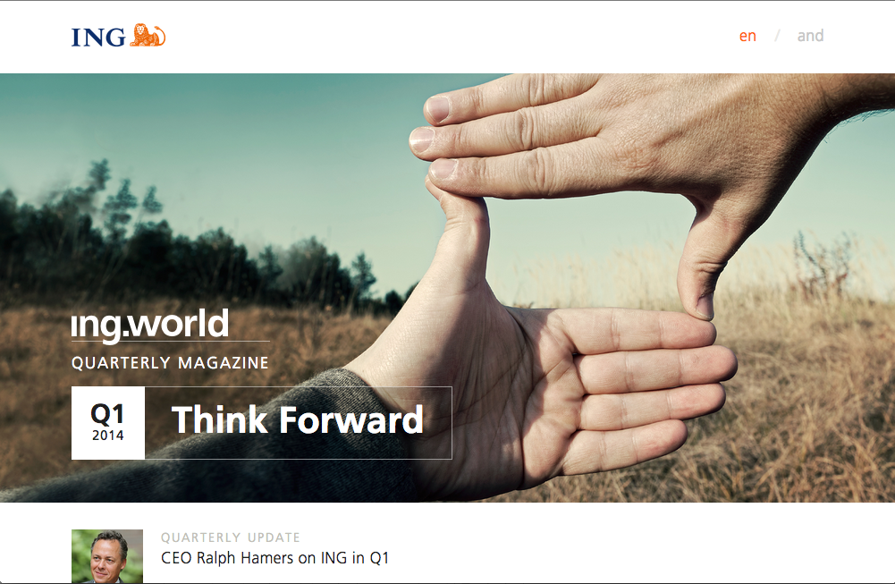
The next website i looked at was ING World Magazine, the website is very responsive to other devices and i like the way it responds to each device.
I like the layout of the website as it is a single column website that uses the full width of the device you are viewing the website on. While the content of the website is mainly images that link to other parts of the website, the home page is very simple and user friendly, you can see that the main focus is the styling on this website; as it is a magazine it is understandable that this is the main concept. A lot of hover zoom and z-index is used to create a 3-D effect for the user when they are scrolling down the page. I personally like this style on websites and would like to use it on my own websites however it takes a lot of time and is a very advanced piece of coding to be able to get it right!
ING World Magazine
The next website i looked at was ING World Magazine, the website is very responsive to other devices and i like the way it responds to each device.
 |
| Desktop Version |
 |
| Tablet Version |
 |
| Mobile Version |
I like the layout of the website as it is a single column website that uses the full width of the device you are viewing the website on. While the content of the website is mainly images that link to other parts of the website, the home page is very simple and user friendly, you can see that the main focus is the styling on this website; as it is a magazine it is understandable that this is the main concept. A lot of hover zoom and z-index is used to create a 3-D effect for the user when they are scrolling down the page. I personally like this style on websites and would like to use it on my own websites however it takes a lot of time and is a very advanced piece of coding to be able to get it right!
The way the website responds to other devices is very simple and manages to maintain the same style throughout each devices, so you know you are on the same website where as other websites look very different on the mobile version in comparison to the desktop version.
Glastonbury Festival
Glastonbury Festival is a music festival that happens every year in Somerset and is certainly the most popular music festival in the U.K. Recently the website got a new design that is fully responsive to other devices.
 |
| Desktop Version |
 |
| Tablet Version |
 |
| Mobile Version |
The third website I looked into was Glastonbury Festival. As of last week they re-designed and launched a brand new website for this years event.

The new website does bring a different look and feel that i do think is new and brings a new vibe to it. It definitely has a Art style to it which Glastonbury is a festival of "Contemporary Performing Arts". The font style is a Bold "LeagueGothicRegular" and the texture looks like it has been spray painted on to a wall to give that "youthful" look about it. The colour scheme are very bright colours, which of most are primary colours. There are no colours that contrast together, the colours do match with the banner that appears at the top of each page, but i think they also wanted to use colours that were the most bright and eye catching to the user and not go into too much detail with the reasoning behind it.
The website is split into two columns. On the home page there is a slideshow showing off all the acts that are performing that goes across the width of the page, but underneath that are small boxes that are headings of the big news that is happening at the event.

I think this a good use as it makes the website not too text heavy, especially as its only the home page so you wouldn't want it full of text as this can seem unappealing to the user.
On the right column is a list of useful information such as ticket information, how many days until the event and live tweets from their official Twitter account. This column is the same on each main page as it is vital information that people will most likely want to be able to access from anywhere and not want to have to go back and forth between pages to find out some important info.
In my website I would like the responsiveness of the ING World magazine when it scales down from Desktop to Mobile, and the simplicity of the Glastonbury Website in terms of content. I do like the art style Glastonbury has but i don't think it would work for a website about Oceans. I might try and experiment to see if any art style would potentially work while keeping the audience relevant and not completely changing the original look and feel.
No comments:
Post a Comment